LiquidLab
LIQUIDLAB
Applied the fundamentals of layout, typography, and responsive design to create a HOMEpage for a HYPOTHETICAL LOCAL cold press juice bar.
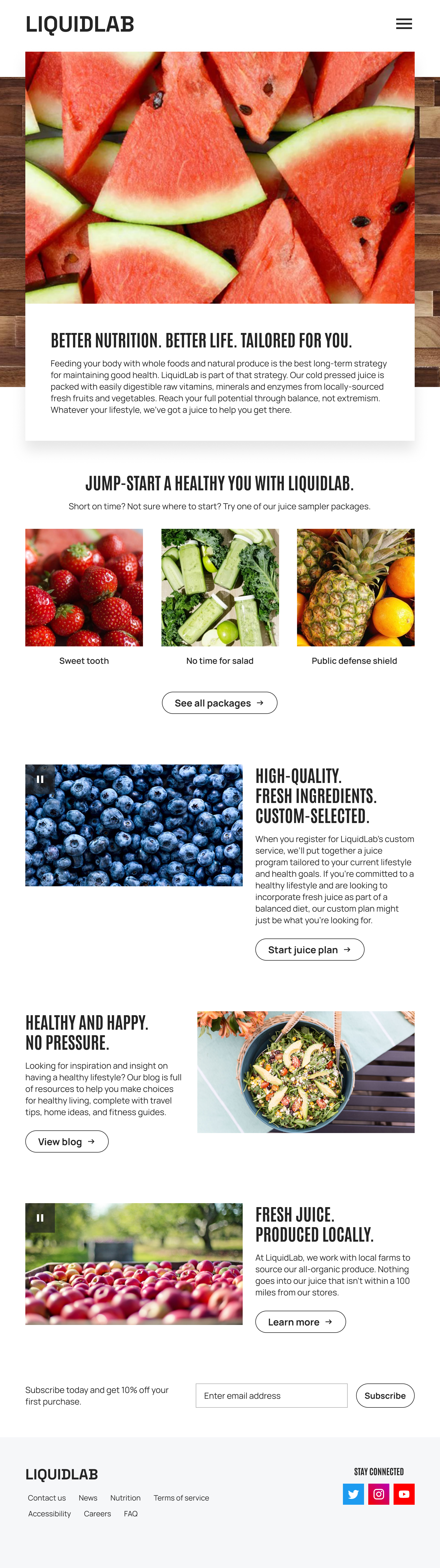
The vision behind LiquidLab is to establish it as the go-to wellness service for suburban dwellers who want to live healthier and eat more intentionally. To bring that vision to life, the strategy focuses on guiding those individuals toward a personalized juice plan — one that LiquidLab curates around their specific tastes and health goals, making the path to better nutrition feel effortless and tailored.
WIREFRAME
The header greets visitors above the fold with a layered hero image set against a textured background, creating an immediate sense of depth and dimension. Below the fold, the layout leans into white space to guide the eye naturally from one section to the next, giving each moment on the page room to resonate. Alternating horizontal content placement between sections adds a quiet rhythm and visual balance throughout. The footer wraps the experience cleanly with a newsletter signup, navigation, and social links.

STYLE GUIDE
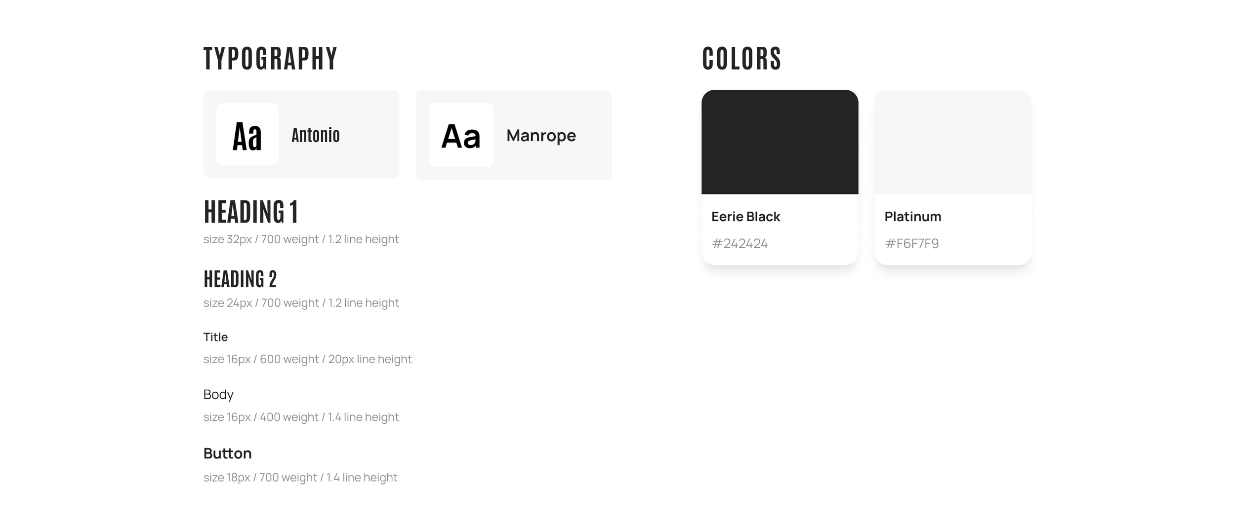
The typographic pairing was chosen with intention. Antonio brings a compressed, high-impact presence to headers, while Manrope, with its geometric, semi-grotesque character, keeps body text clean and legible at any size. The color palette is deliberately stripped back to black and white, a choice that lets the vivid natural colors of the fruit and vegetable imagery on the homepage do the talking. That same philosophy carries into the product design: juice bottles are clear with a transparent vertical label in white text, and in-store cups are clear with the LiquidLab logo printed horizontally in white, letting the product itself remain the focal point.