LOAN APP EXPERIENCE
LOAN APP EXPERIENCE
An optimized loan application interface for Acorn Finance that helps borrowers quickly access the financing options available to them.
The project set out to accomplish two things: strengthen the application's consistency with the Acorn Finance brand and make the process feel more seamless for borrowers from start to finish. Achieving both objectives translated directly into a higher application completion rate.
OLD DESIGN
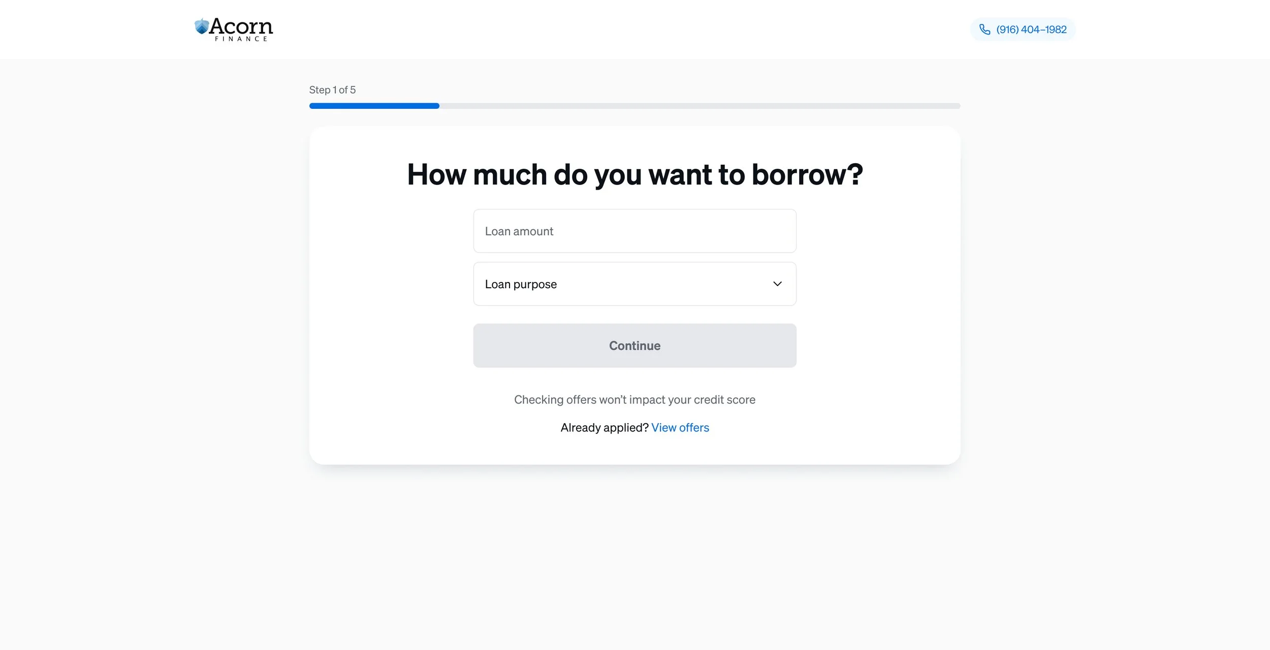
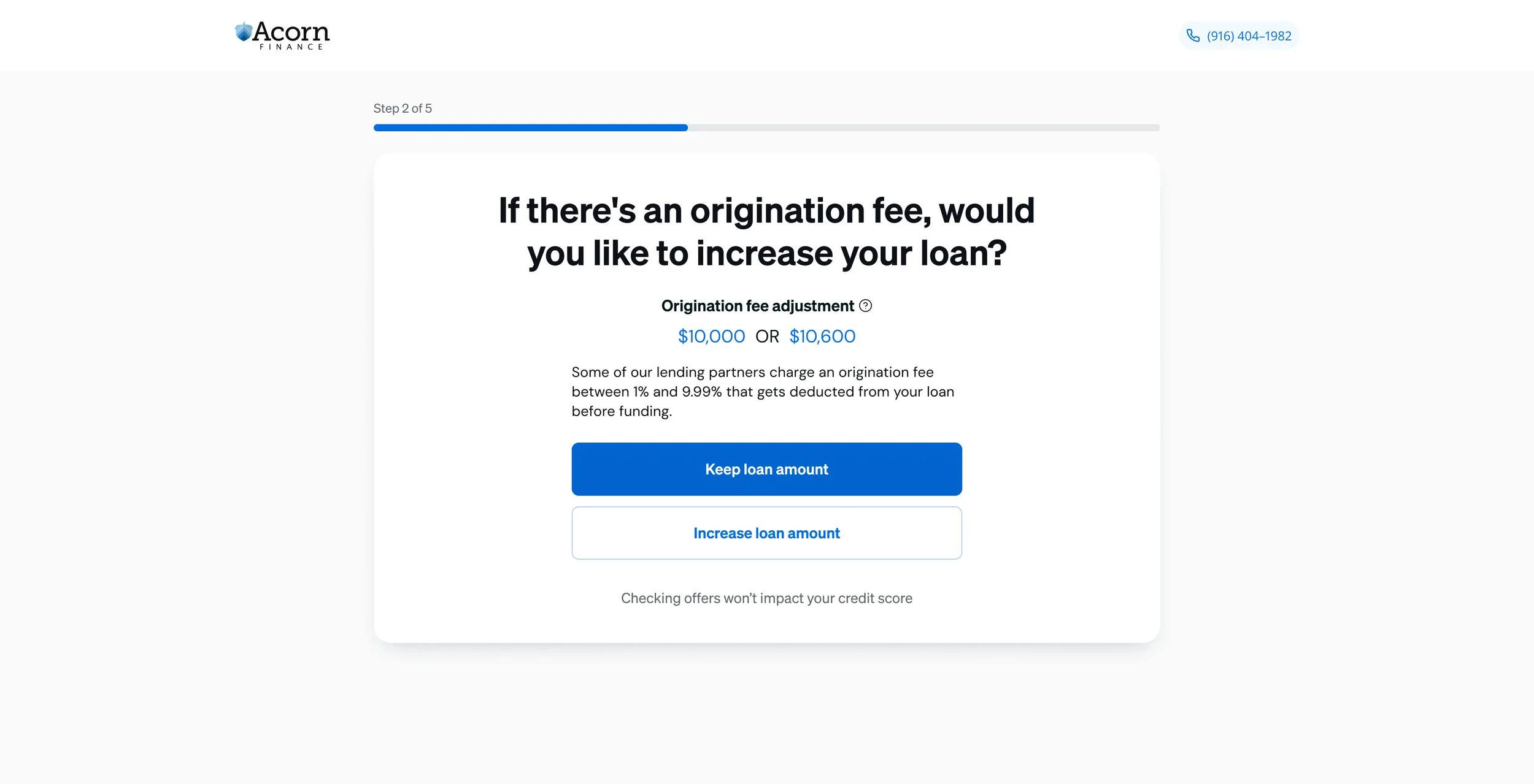
The interface was designed with the borrower's experience at the forefront. A structured layout and consistent blue color scheme create a cohesive and professional feel, while presenting one step per screen keeps the process focused and reduces cognitive load. Bold, labeled blue buttons make navigation intuitive and effortless. A progress bar above each step offers borrowers a rewarding sense of accomplishment as they move through the application, and a prominently displayed customer support phone number in the header ensures help is always within reach. Taken together, the design is minimalistic and efficient, prioritizing clarity above all else.

RE-DESIGN
Feedback from UX research and the existing user base confirmed that the step-by-step structure was working, so it stayed. What changed were the details that were quietly getting in the way. Each step had been enclosed in a white container that constrained the scale of buttons and key text, limiting touch areas and creating unnecessary frustration. Removing the container freed the layout, allowing buttons to expand to the margins for a more comfortable and accessible interaction. The progress bar was moved to sit flush below the header at full width, giving borrowers a clearer, more prominent way to track where they are in the process.
Typography received attention as well. The heading text for each step had been underselling itself, carrying less visual weight than the buttons it sat above and matching the weight of input fields below. Applying the design system's H3 heading style corrected the hierarchy, ensuring the most critical information draws the eye first. To close out the refinements, multiple-choice buttons were shifted from solid blue to white with a gray border, easing the visual load on borrowers. Blue icons were introduced beside each label, adding intuitive visual cues and a touch of polish to the overall aesthetic.

NEW DESIGN
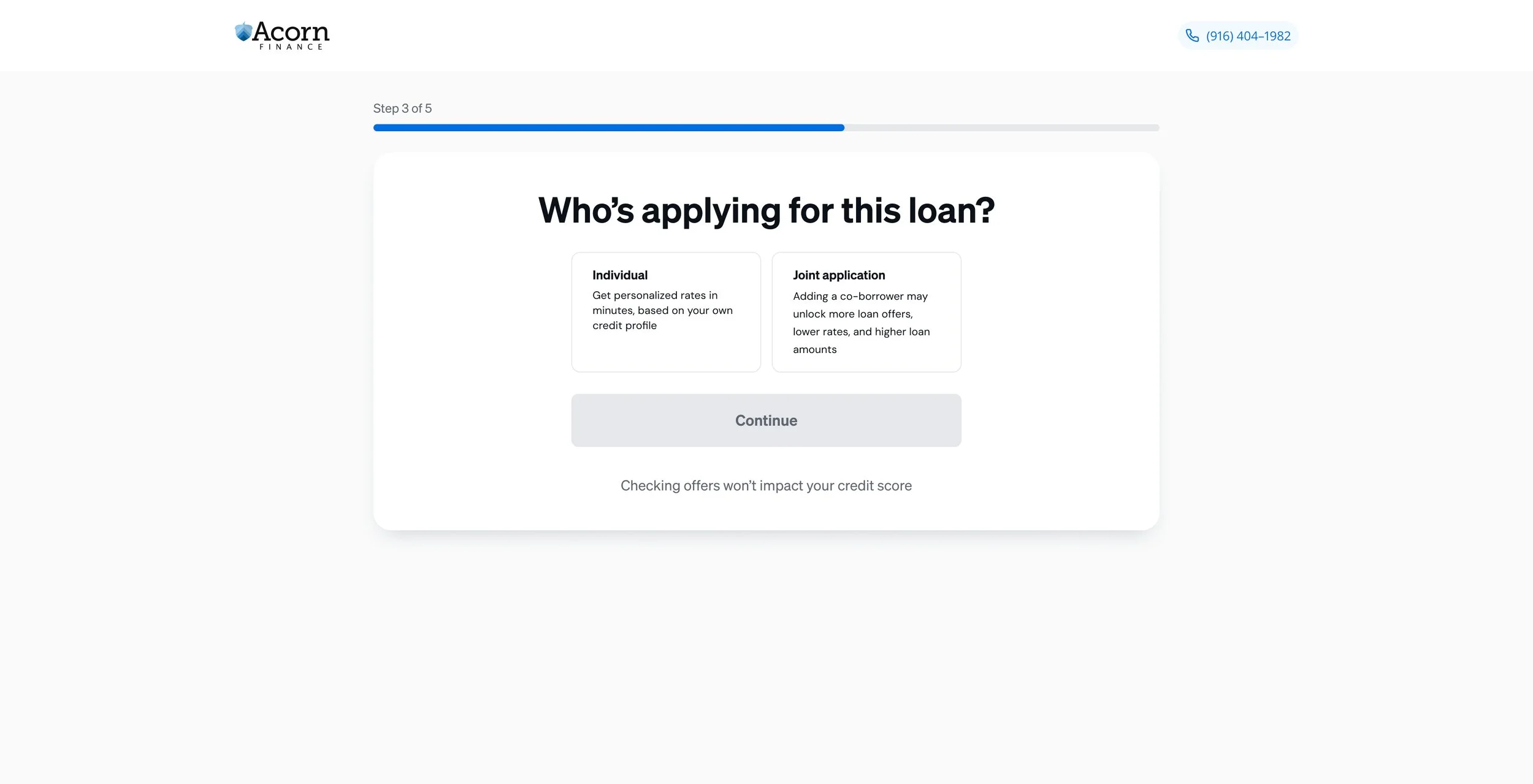
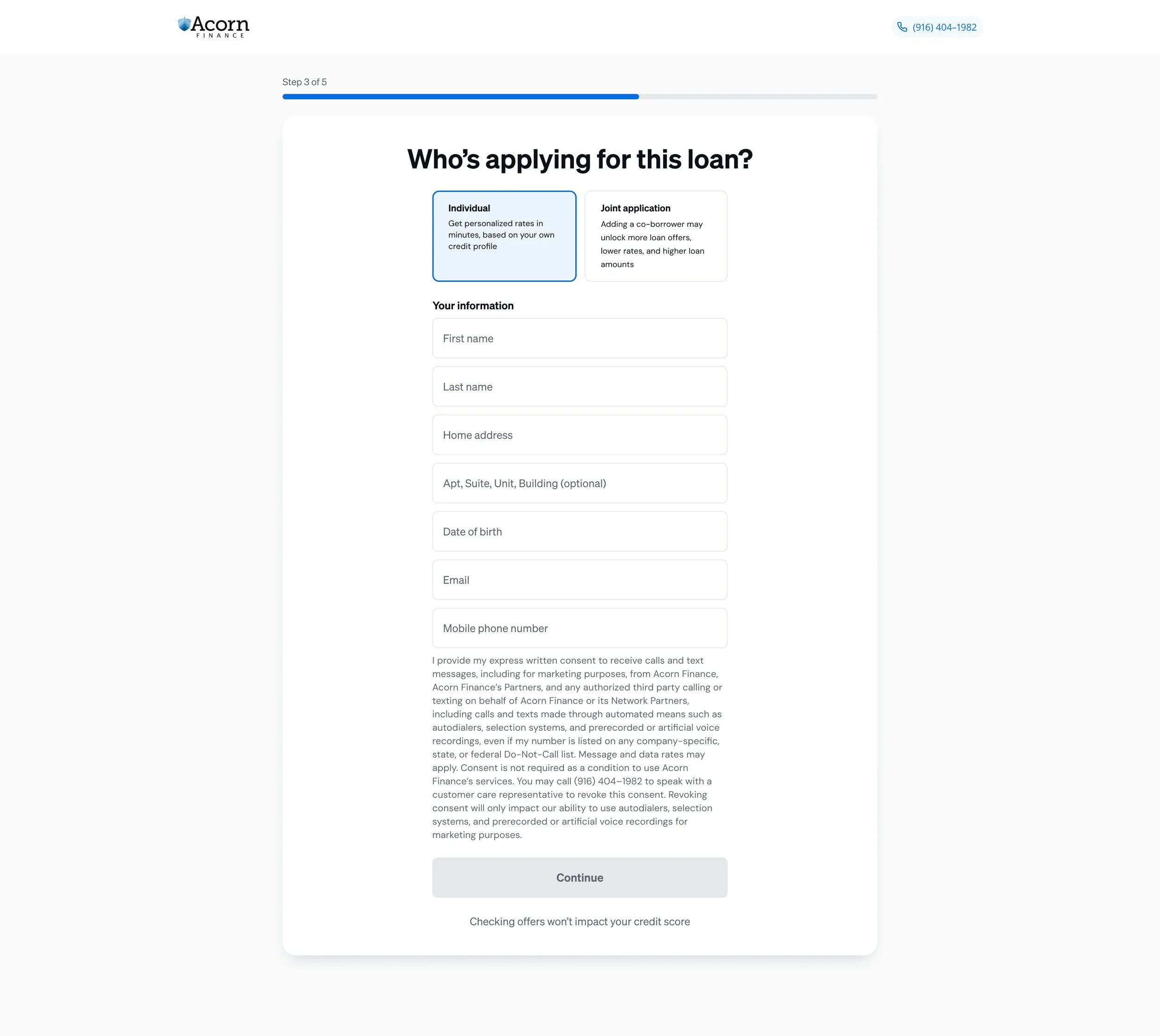
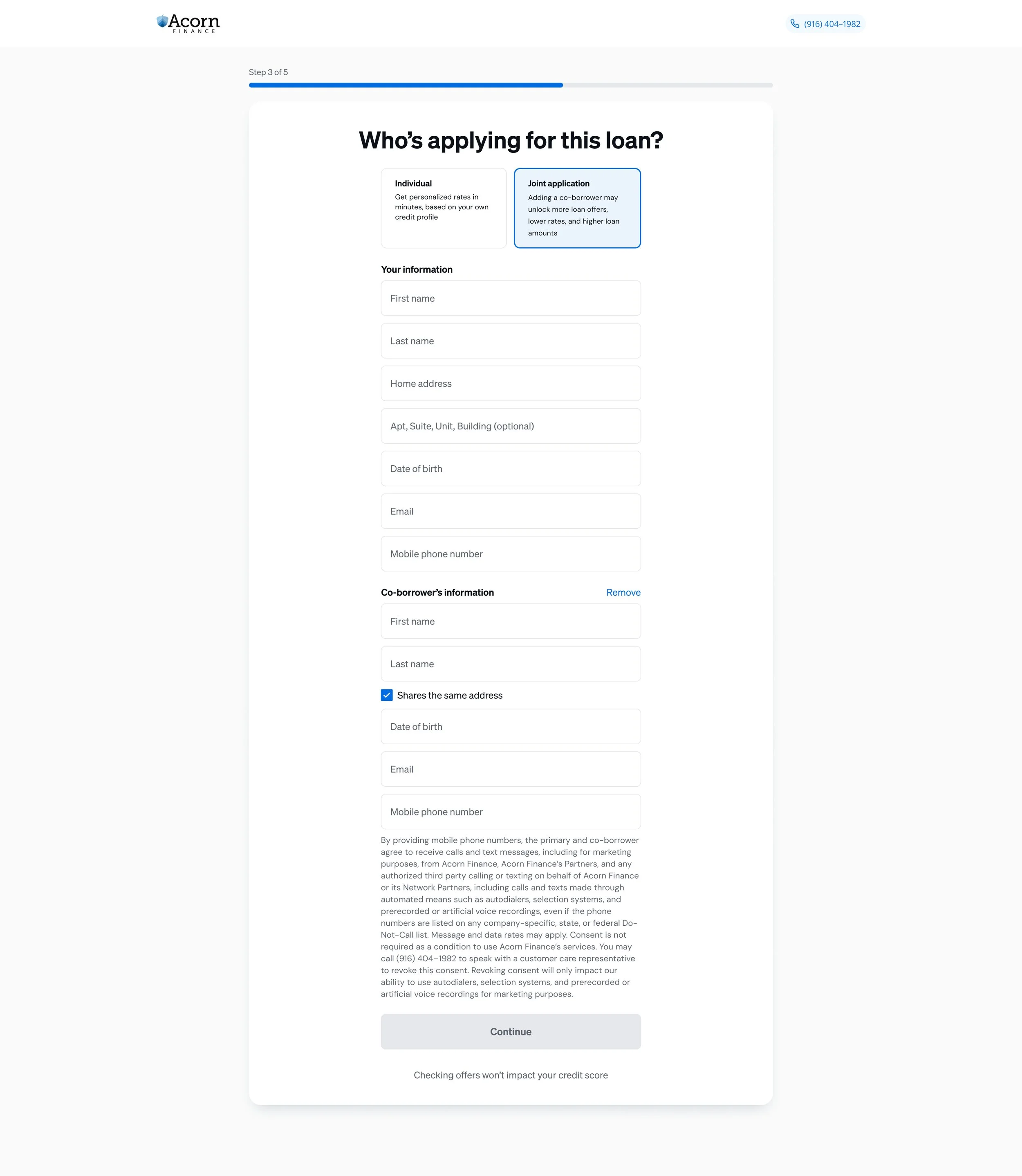
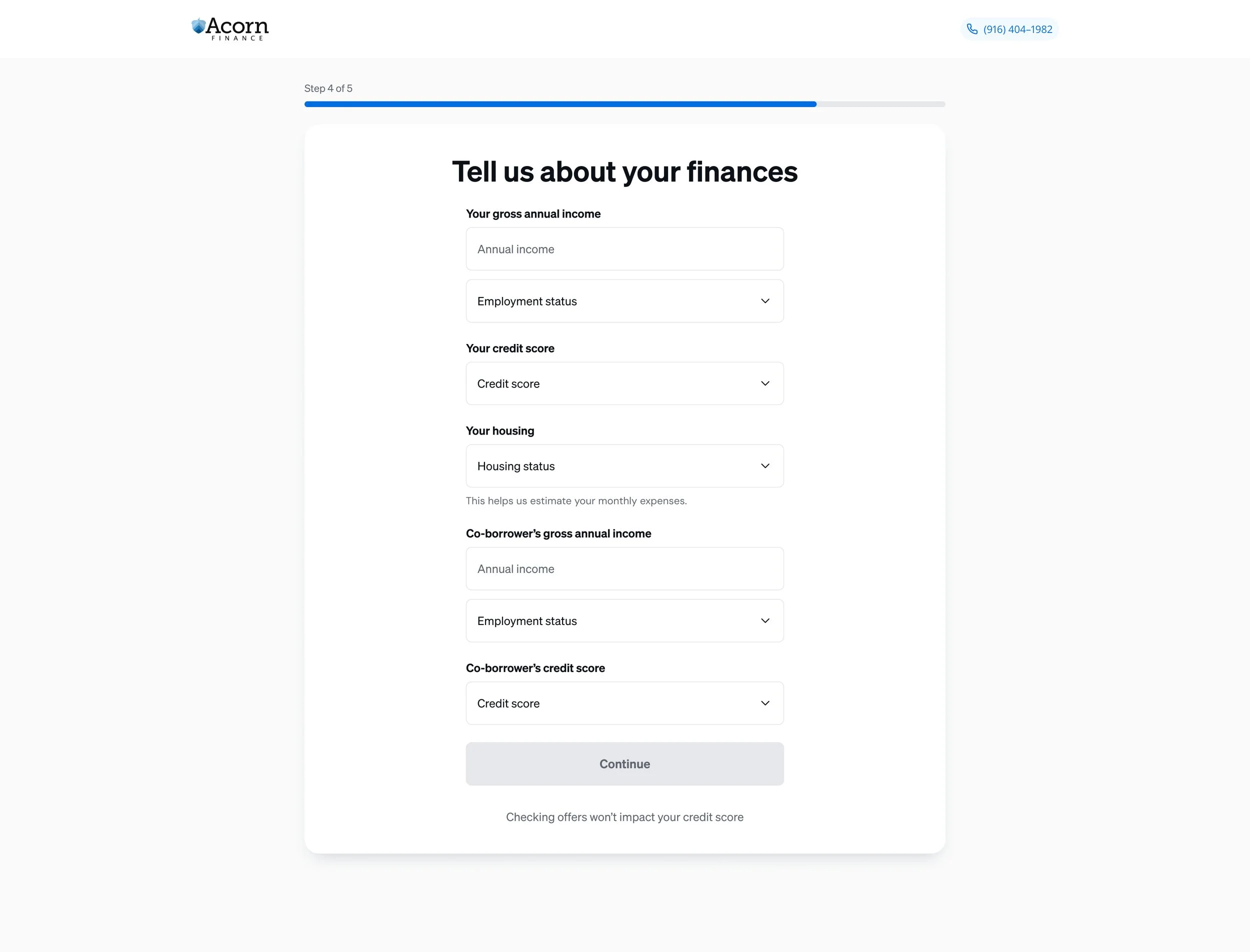
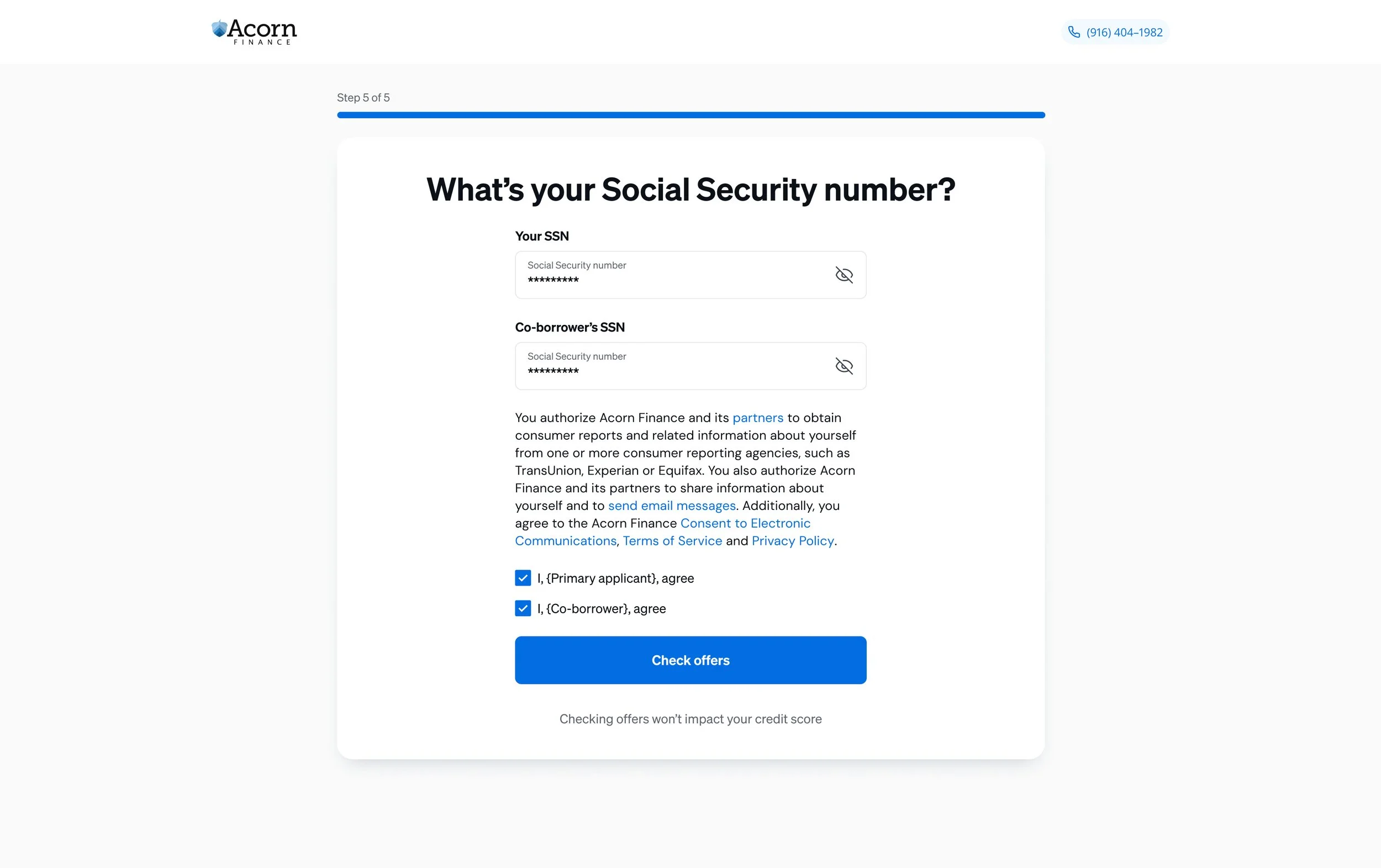
In the original application, applicants completed their own personal information and finances before being asked, at the very end, whether they wanted to add a co-borrower. I knew there was a better experience, so I collaborated with the VP of Experience to make the joint decision an early part of the flow. The new design asks "Who's applying?" at step 3 and expands the form inline to collect both applicants' information together, with a shared-address shortcut and joint finances and Social Security steps. Along the way, I consolidated 18+ single-question screens into five topic-based steps. It's approved and rolling out in a limited launch before a full release. Expectations are that the completion rate should astronomically improve.